A Power BI waterfall chart is used to show how a starting value increases and decreases step by step until it reaches a final value.
Mastering Power BI Waterfall Charts: Techniques That Actually Work
POST BY
PUBLISHED
May 20, 2026
Understanding numbers is easier when you can see the story behind them. Most reports only show the final result, without explaining how it was reached. That’s where Power BI waterfall charts come in; they help explain how a starting value changes through a series of increases and decreases before reaching a final result.
It basically breaks a number into small steps so you can see what pushed it up or pulled it down. Instead of guessing, you can actually trace the change, and they are especially useful in finance, operations, and performance reporting because they show the drivers behind change, not just the totals.
A clear waterfall chart can make profit and loss analysis, budget variance, headcount movement, and KPI changes easier to understand.
This guide is basically to help you simply understand waterfall charts. It covers what they are, how they’re different from bar charts, when they actually make sense to use, and how to set up your data so the chart tells a clear story instead of just showing numbers.
What Is a Waterfall Chart in Power BI?
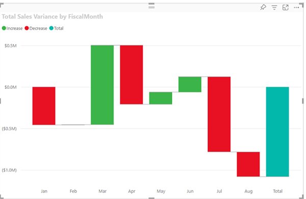
A waterfall chart in Power BI shows a running total as values are added and subtracted. You can think of it as a visual bridge between a starting point and an ending point, with each column showing the impact of one change along the way.
In Power BI reporting, waterfall charts are useful because they turn a sequence of changes into a clear visual path.
Take a simple example, you start with ₹50,000. Then you earn a bit more, spend on rent, and handle a few expenses. Instead of showing just the final number, a waterfall chart breaks it down step by step so you can actually see what happened in between.
Each increase or decrease is shown as a separate column. Usually they’re color-coded, so it’s easy to spot what went up and what went down. Microsoft describes waterfall charts as a way to show how an initial value is affected by a series of positive and negative changes.
Usually, the first and last values begin at the horizontal axis. The columns in the middle float between those two values because each one starts where the previous value ended. This structure makes the visual easy to follow, especially when explaining why revenue, profit, costs, or another KPI moved from one number to another.
For teams that need more advanced formatting, variance analysis, and reporting features, Zebra BI provides guidance and tools for creating advanced Power BI waterfall charts with features such as automatic variance calculations, horizontal waterfalls, small multiples, comment markers, and IBCS-compliant reporting.
Waterfall Visualization Components
A Power BI waterfall chart relies on a few key parts that work together to explain change. The first and last bars typically represent the opening and closing totals. The columns between them represent the steps that move the value up or down.
Here are the main components:
- Starting point: The original value, such as opening balance, starting revenue, or planned budget.
- Upward columns: Positive drivers that increase the running total, such as sales growth, new revenue, or cost savings.
- Downward columns: Negative drivers that decrease the running total, such as expenses, churn, discounts, or overruns.
- Endpoint: The final value after all positive and negative changes are applied.
- Color coding: Visual separation between increases and decreases, often using green for positive movement and red for negative movement.
- Connecting lines: Optional horizontal lines that help viewers track the movement from one column to the next.
The floating bars are what make the waterfall chart different from a standard column chart. A positive value starts from the previous total and rises upward.
A negative value starts from the previous total and falls downward. This makes the chart useful for showing progression rather than isolated comparisons.
How Waterfall Charts Differ From Bar Charts
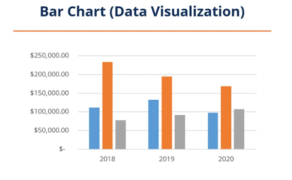
Bar charts compare values across categories or time periods. They are useful when the goal is to compare totals, such as revenue by quarter, sales by region, or expenses by department.
Waterfall charts explain the composition of change. They show how a value moved from one point to another and what contributed to that movement. Instead of treating each category as a separate total, a waterfall chart connects each step to the one before it.
The difference is simple. A bar chart answers, “Which value is higher or lower?” A waterfall chart answers, “Why did the value change?”
For example, a bar chart can show that net profit was lower this quarter than last quarter. A waterfall chart can show whether that decrease came from lower sales, higher payroll costs, supply chain expenses, discounts, or tax changes.
Pie charts are even less suitable for this type of analysis because they show parts of a whole at one point in time. They do not show sequence, negative values, or cumulative movement. Use a bar chart for comparison. Use a waterfall chart for explanation.
When To Use Waterfall Charts
Waterfall charts work best when the audience needs to understand the drivers behind a change. They are common in financial reporting, but they also apply to operations, sales, project management, and data quality analysis.
Common use cases include:
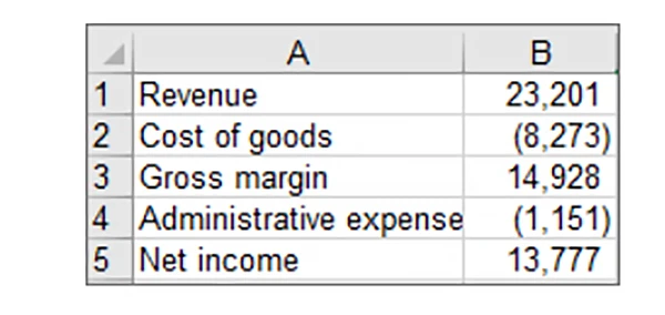
- Profit and loss reporting: Show how revenue, cost of goods sold, operating expenses, and other items contribute to the final profit or loss.
- Budget versus actual analysis: Explain why actual results differ from the planned budget.
- Variance analysis: Break down positive and negative differences between forecasted and actual values.
- Headcount movement: Show how hires, departures, transfers, and role changes affect the ending employee count.
- Cash flow reporting: Track inflows and outflows to explain the movement from the opening balance to the closing balance.
- Project cost tracking: Show how each cost category contributes to the final project budget.
- KPI movement: Explain how different factors affect a metric such as margin, customer count, recurring revenue, or inventory levels.
A waterfall chart is especially effective when the order of changes matters. If the chart has too many columns, however, it can become difficult to read.
In most reports, it is better to focus on the most important drivers and group small items into an “Other” category.
Setting Up Your Data for Waterfall Charts
Good waterfall charts start with a clean data structure. The visual needs clear categories, positive and negative values, and a logical order.
If the underlying data is inconsistent, the chart will be difficult to read, no matter how much formatting you apply.
Importing Your Dataset
Power BI Desktop gives you several ways to import data. You can use Excel files, CSV files, databases, dataflows, and other connected sources.
Once your data is loaded, review the fields you plan to use before creating the visual.
At a basic level, your dataset should include:
A category field: This defines the columns in the waterfall chart, such as months, departments, cost categories, or variance drivers.
A value field: This contains the numeric change for each category.
A sort field: This controls the order of the columns so the chart follows the correct sequence.
After importing your data, add a new report page or use an existing report canvas. Select the waterfall chart from the Visualizations pane, then assign your category and value fields.
Power BI can then build the initial visual, which you can refine through sorting, formatting, labels, and colors.
Creating Calculated Measures With DAX
DAX measures can make waterfall charts more flexible, especially when you need to switch
between different metrics or calculate custom variance values.
The SWITCH function is useful when you want one measure to return different results based on a selected category or index. Microsoft explains that SWITCH evaluates an expression against a list of values and returns one of several possible results.
A simplified pattern looks like this:
SWITCH(SELECTEDVALUE(Table[Index]), 1, [Revenue], 2, [Costs], 3, [Profit])
This approach can help you control which measure appears at each step of the waterfall. It is often used with a disconnected control table that stores labels and sort order values.
The table can include items such as Starting Revenue, Sales Growth, Discounts, and Operating. Cost, and Ending Profit.
Calculation groups can also help in more advanced models because they reduce the need to create many separate measures.
They are useful when the same logic needs to apply across several metrics, time periods, or reporting scenarios.
Structuring Categories and Values
A waterfall chart needs categories that tell a clear story. Avoid adding every possible detail to the visual. Too many columns can hide the message and make the chart harder to interpret.
Three data types matter most:
Categorical data: Labels that organize the steps, such as revenue, expenses, margin adjustments, or business units.
Time-series data: Period-based values, such as months, quarters, or fiscal years.
Quantitative data: Numeric values that represent the positive or negative impact of each category.
Make sure decreases are stored as negative values and increases are stored as positive values. This allows Power BI to position each bar correctly. Also, check that your sort order matches the story you want to tell.
For example, a profit bridge might begin with revenue, move through cost categories, and end with net profit.
If some categories are small, consider grouping them. A chart with 8 to 12 meaningful columns is usually easier to understand than one with 25 minor items. The goal is not to show every row of data.
The goal is to explain the main reasons the number changed.
Practical Formatting Tips
Once the chart is built, formatting determines how easily people can understand it. Clear labels, consistent colors, and a logical layout can make the difference between a useful financial visual and a confusing one.
Start with a descriptive title that explains the purpose of the chart. Instead of “Waterfall Chart,” use something more specific, such as “Profit Movement From Budget to Actual” or “Revenue Bridge by Segment.”
Use color carefully. Increases and decreases should be easy to distinguish, but the palette should still match the report’s overall design. Avoid using too many colors because they can distract from the main story.
Turn on data labels when the values are important for decision-making. Keep labels readable and avoid unnecessary decimals. For financial reporting, use consistent number formatting across the report.
Finally, review the axis and category names. Long labels can be shortened without losing meaning. For example, “Increase in Operating Expenses” can become “Operating Expense Increase” if space is limited.
Common Mistakes To Avoid
Sometimes a chart looks fine at first, but a small setup issue can change how people read it. That’s where waterfall charts can go off track.
Waterfall charts are powerful, but they can become misleading when they are poorly structured. One common mistake is using them for simple comparisons. If you only need to compare totals across categories, a bar chart is usually better.
Another issue is poor sequencing. A waterfall chart should follow a logical path from start to finish. If the categories appear in random order, the visual will not explain the change clearly.
Data sign errors are also common.
A cost or loss should usually appear as a negative value. If negative items are entered as positive numbers, the chart can suggest the opposite of what happened.
Too many categories can weaken the chart as well. A waterfall chart should highlight the main drivers of change. If every minor adjustment gets its own column, the audience may miss the important points.
The last mistake is weak context. A chart should not stand alone without a clear title, labels, and a surrounding explanation. Viewers should be able to understand what changed, why it changed, and which drivers matter most.
Conclusion
When you look at numbers closely, the real story is usually in how they changed, not just where they ended up. That’s where Power BI waterfall charts become useful; they help explain how a value moved from one point to another. They work well for financial reporting, variance analysis, KPI reviews, headcount tracking, and project cost analysis.
The strongest charts start with clean data, clear categories, accurate positive and negative values, and a logical sort order. Formatting also matters because labels, colors, and titles help viewers understand the story quickly.
Native Power BI waterfall charts can handle many basic use cases, while advanced reporting scenarios may call for more specialized visuals that support deeper variance analysis, clearer storytelling, and stronger financial reporting standards.
FAQs
What is a Power BI waterfall chart used for?
How is a waterfall chart different from a bar chart?
A bar chart compares values, while a waterfall chart shows how a value changes step by step and what caused the change.
What type of data is needed for a waterfall chart?
You need categories (like revenue or expenses) and values that can be positive or negative, arranged in the right order so the flow makes sense.
What are common mistakes in waterfall charts?
Using too many categories, messing up positive and negative values, wrong ordering, or trying to include too much detail in one chart.